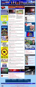
Georgia Associated Press, Class B TV, 2007
In 2007 wrdw.com was awarded Best Website from the Georgia Associated Press, Television Class B. Class B encompasses all Georgia markets outside of Atlanta.
A new three-column template was rolled out by corporate in January. I designed all graphics and advertising and selected colors and font styles. The new template included an embedded video player for the first time, something I had advocated since my hire in early 2006.
My focus in 2007 was on funneling the visitor’s eye towards the main content, which at that time was the written news stories in the middle column. In later years, as technology improved, we shifted the site’s focus more towards our video product.
We also added a “Find It” button that took viewers to our links page. While the idea of the button was not new, I built ours so that it animated on hover and made a clicking sound when clicked. It was a fun novelty that got people’s attention. After people had a few months to get used to it, it no longer needed to be so flashy, so I scaled it down and removed the sound effect.
One thing I am very proud of about all the iterations of wrdw.com that I oversaw is the commitment to the user. All designs have been less about “Web 2.0” and more about serving our local community. I purposefully did not make them sleek. They were targeted towards the general Augusta audience, not just the “savvy”. I’m sure that’s part of what impressed the AP in 2007: we put the focus on our audience and our content.